
What is Data Storytelling?
Data storytelling refers to the practice of turning complex data analyses into simple language to support an organizational decision or action. The purpose of data analysis is to extract relevant insights from data so that a target audience can understand and contextualize them. The Bureau of Labor Statistics predicts that the demand for research analysts will rise by 25% between 2020 and 2030, substantially faster than the overall industry average. While some organizations have chosen to employ data storyteller positions to augment the skills of their current analytics teams, many have started to include data storytelling as a mandatory ability in analyst job descriptions.
The Goal of Data Storytelling
Understandably presenting data analysis findings and assisting in decision-making are the objectives of data storytelling.
The Benefits of Data Storytelling
Though it offers the advantages of deeper insights and supporting evidence in the form of graphs and charts, data storytelling is remarkably similar to human storytelling. Data storytelling simplifies complicated data, allowing your audience to connect with your material and make key decisions with greater speed and confidence.
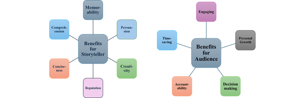
Creating a compelling data story that inspires action can be a very effective strategy. People and your business can benefit from effective data storytelling. Successful data storytelling has several advantages, such as:
- Enhancing your insights and data.
- Interpreting complicated data and emphasizing important details for the audience.
- Giving your data a human touch.
- Adding value for your industry and audience.
- Establishing credibility as a thought leader in the field.
Components of Data Storytelling
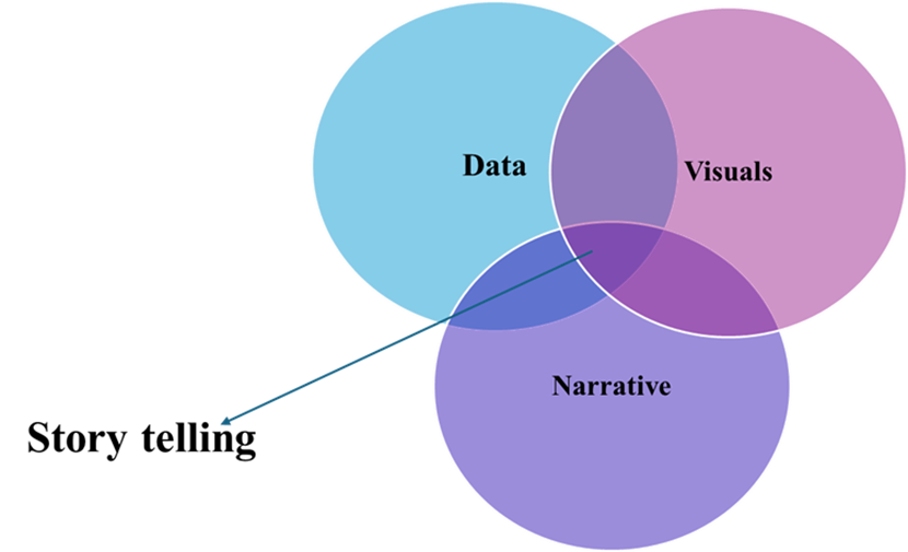
There are three important components of data storytelling:
The following three components should be included when writing a data story to provide a comprehensive account of the theory and the actions one hopes people will take as a result.
- Supporting Data: Humans are not naturally drawn to analytics, particularly those that lack contextualization via additional analytics. A thorough study of correct, full data forms the basis of your data story. Analyzing data utilizing diagnostic, descriptive, predictive, and prescriptive analysis can help you see the big picture.
- Building a Narrative: A written narrative, sometimes known as a storyline, is used to explain data insights, the context around them, and the behaviors that the author promotes and hopes to inspire in his audience.
- Enlightening Visualizations: Visual representations of facts and narrative can help communicate the tale clearly and effectively. These can include charts, graphs, diagrams, images, and movies.
What makes a good data story?
Besides data, narrative, and visualizations, a good data story must also include the following elements:
- Settings: The settings should be based on data. If the data concerns internal systems, the setting is within an organization that has the same internal configuration.
- Conflict: The conflict is any issue and the consequences of that issue that the data may reveal. The battle has an impact on the characters and the location.
- Characters: Customers, the organization, stakeholders, and other significant participants in the data may be represented by the characters.
- Resolution: The resolution is a proposed answer to any obvious issues or anything that may aid in decision-making processes.
Some Data Storytelling Tools
An expanding set of data storytelling tools is meeting the demand for improved storytelling. Here are some examples of these tools:
- Juicebox
Juicebox mixes a current data journalism style with exploratory graphics that are automatically linked to facilitate analysis. Juicebox is the only tool in this category that is suitable for non-technical or non-analyst users due to its emphasis on easy authoring.
- Flow Immersive
A distinct approach to imagery and storytelling. This platform focuses on eye-catching 3D visual outputs that include films or Prezi-like presentations.
- Toucan Toco
Toucan Toco was one of the first solutions for data storytelling. This platform focuses on enterprise buyers and takes a unique way of presenting data stories. Sharing, annotation, and drill-in narrative views allow you to provide a full overview of a topic.
- Nugit
Nugit has slipped under the radar for some consumers, yet it is one of the most comprehensive data storytelling solutions on the market. This solution is worth looking into because of its attractive design and powerful text features.
- Flourish (acquired by Canva)
Flourish has created a devoted customer base by providing imaginative and attractively made visualizations. They are well-known for their racing bar charts, but they also provide a variety of other visual possibilities.
References
- https://powerbi.microsoft.com/en-us/data-storytelling/
- https://online.hbs.edu/blog/post/data-storytelling
- Ren, P., Wang, Y., & Zhao, F. (2023). Re-understanding of data storytelling tools from a narrative perspective. Visual Intelligence, 1(1), 11.
- Echeverria, V., Martinez-Maldonado, R., Granda, R., Chiluiza, K., Conati, C., & Buckingham Shum, S. (2018, March). Driving data storytelling from learning design. In Proceedings of the 8th International Conference on Learning Analytics and Knowledge (pp. 131-140).
- Echeverria, V., Martinez-Maldonado, R., & Buckingham Shum, S. (2017, November). Towards data storytelling to support teaching and learning. In Proceedings of the 29th Australian Conference on Computer-Human Interaction (pp. 347-351).

MPhil, PhD Microbiology
Follow me ⬇️


1 comment